Ligature
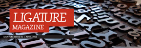
Courtney Simchick’s square Ligature frames the content and uses a friendly, readable type design, giving the design a space to change from feature to feature, and still keep an inviting quality.
Typographic Review
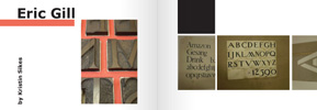
Mariel Rushing’s Typographic Review uses an oversized format and lots of white space to play with blocks of type as well as blocks of color and images, creating a very grid-like, but still open magazine.
Spectrum
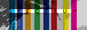
Brendan Callahan’s Spectrum takes design cues from 90s typography and other sources to create a visually compelling, yet still readable publication.