Professional and Graduate Work
Graduate
St. Peter Erosion (Print)
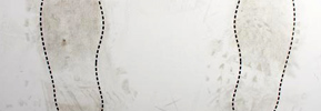
Shoe treads on this print – about the St. Peter statue at the Vatican – become discernible and the “data” from the footprints eventually takes on an importance if its own.
St. Peter Erosion (Digital)
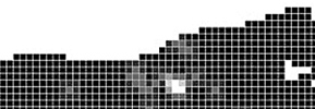
Visitor clicks in this Flash piece – about the St. Peter statue at the Vatican – become discernible and erode the original image that existed.
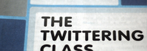
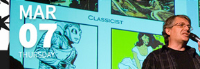
John Maeda Lecture Poster
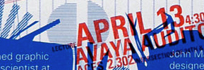
A poster as a series of unique multiples, this poster uses different sized pieces of information that shift in and out of sync with one another.
Uday Dandavate Poster
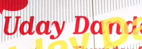
A poster for a lecture by Uday Dandavate. Multiple versions of the poster by different designers layer on top of one another with an extra layer to filter the information.
Gail Swanlund Poster
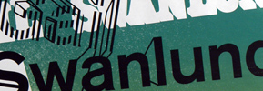
A poster for a lecture by Gail Swanlund. The poster came out of a system where individual designers contributed but no designer could completely design the poster.
3D Type Calendar
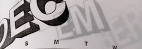
Calendar commenting on the passage of time through the use of three-dimensional type within a book.
Identity
UT PAC Identity
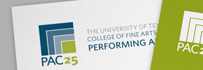
Design of an identity and accompanying paper system for the UT Performing Arts Center’s 25th Anniversary.
Global Campus Identity

Design of an identity for a new online university in The University of Illinois System.
Pangaea: Issue 1
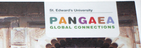
Pangaea: Global Connections is a journal at St. Edward’s University highlighting student views on globalization. It is edited and designed by SEU faculty. Issue 1
Pangaea: Issue 4
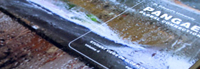
Fourth issue of Pangaea: Global Connections, a journal at St. Edward’s University highlighting student views on globalization.
Pangaea: Issue 3

Third issue of Pangaea: Global Connections, a journal at St. Edward’s University highlighting student views on globalization.
Pangaea: Issue 2

Pangaea: Global Connections is a journal at St. Edward’s University highlighting student views on globalization. It is edited and designed by SEU faculty.
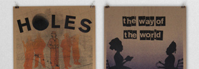
Posters: Aisle 7
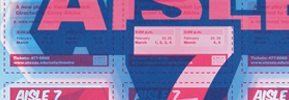
A money-saving poster that splits into 9 separate flyers for a play by The University of Texas Department of Theatre & Dance.
Type
Forking Paths Typeface

A font that allows users to generate their own typefaces on the fly using the numeric keypad to “draw” letters.
Erode Typeface

Typeface that mimics digital erosion with the inclusion of an alternate,“eroded,” version of every character.
Web
UT PAC Site
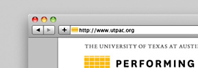
A redesign of a site for UT’s Performing Arts Center. Designed comps and visual elements, planned site, including architecture and technical needs.
Yes for Seatac
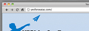
Design and development of a site for a winning campaign for a living wage in Seatac, WA.
Ballet Austin Site
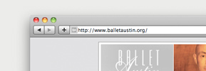
Redesign for a ballet company’s website, featuring table-less HTML/CSS and Movable Type used as a content management system.
Student Work
Critical Mass
Video – Pollution

In a short video, Chee Sim uses a factory metaphor as a polemic metaphor for pollution and global warming.
Video – Newton’s Cradle

In this video, Michael Sodek draws a connection between Newton’s Third Law, as seen through a Newton’s Cradle, and the American Revolution.
Video – Evolution

Miranda Petrosky uses paper, scanned textures, and drawings to illustrate animals evolving from living in the sea to on land.
Print – Greed

Greg Thomas uses geometric shapes and found images to illustrate the deadly sin, Greed.
Print – Bill of Rights
Nicole Ryder uses found images to illustrate the Third Amendment, prohibiting the quartering of soldiers in homes during peacetime.
eReader
MyBookShelf
Kayla Stark’s MyBookShelf shows the process she went through to use stacked books, friendly typography, relaxing colors, and inviting icons to bring an enriching, real-life feel to users’ book shelves.
Book Rook

Jonathan Lopez’s Book Rook enables users to categorize their books, see their progress while looking at their whole collection, share highlights, and see other readers’ highlights.
Identification Systems
International Style
Jean Viera uses the rationality of Swiss Modernism to create a series of three buttons for an exhibit on Modernism.
International Style

Kelsey Smith uses muted colors and repeated shapes to create an identification system for an exhibit on Swiss Modernism.
Magazine
Typographic Review
Mariel Rushing’s Typographic Review uses an oversized format and lots of white space to play with blocks of type as well as blocks of color and images, creating a very grid-like, but still open magazine.
Spectrum
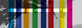
Brendan Callahan’s Spectrum takes design cues from 90s typography and other sources to create a visually compelling, yet still readable publication.
Ligature
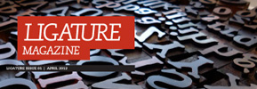
Courtney Simchick’s square Ligature frames the content and uses a friendly, readable type design, giving the design a space to change from feature to feature, and still keep an inviting quality.
Motion – One Day
Leal – Indecision

Erin Leal’s video uses an animated version of her to tell the story of waking up and going about her day as it fills up with choices and obligations.
Chaney – AR Morning
Alton Chaney’s video uses motion tracking to place typography and icons in his life as he goes about getting ready in the morning.
Reframe
Parking – Bike Share

Abbas Deidehban, Marissa Cueva, Margo Sivin, Erica Stivison, and Grethe Ullrich create a bike-promotion program for St. Edward’s University.
Parking – Alternatives

Robin Bishop, Greg Thomas, Corine Brunet, Nate Cordoba, and Clare Szabo propose Affordable Alternatives to parking at school and gives students resources to better enable them to get to school other ways.
Rail – Bags
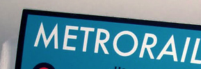
Jean Viera, Song Bowman, Ana Fry, and May Yateem planned, designed, and printed a set of bags, each aimed at a different kind of potential MetroRail passenger.
Rail – Morning
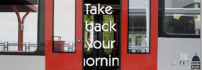
Alex Roka, Roel Macias, and Anne-Marie Defesche designed a broad campaign – with a video and ads – centered around the idea that riding MetroRail frees you from your drive.
Rail – Community Board
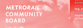
A community board for Capital Metro through which Austinites suggested a MetroRail concert series. Design of interface, and promotional materials, including brochures, tickets, and shirts.
Respond
Rue 32 Typeface
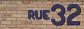
Aaron Arnold uses vernacular type as a model to create a new typeface that responds to small-scale, non-professional design practice.
Cute Nukes Video

Kyle Tweedy created an animated response to compare the amount of budget cuts to the amount spent on nuclear weapons.
Gold Standard Typeface

A typeface by Roel Macias that uses US currency and the golden ratio as inspiration, responding to the US financial crisis.
America Past
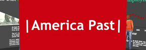
Nicole Ryder creates a walk-through of a museum exhibition from 2111 explaining the 2011 recession.
Web Poster
Westerfield – Greiman

Galen Westerfield’s site takes cues from April Greiman’s work to create a visually engaging mini-site.
Paul – McCloud
Devone Paul’s site for Scott McCloud adeptly uses current web fonts, timed transitions, and a design and implementation that adapt to screen size for compatibility with desktop and mobile devices.